iStock photo – Tippapatt
You want customers entering your store to feel welcome, navigate the space easily, find what they’re looking for and be comfortable enough to make a purchase — all in the same visit.
It’s no different if they’re coming through your online door. The best websites seem to have a knack for ‘getting out of the way’ of a customer or user, allowing them to easily navigate and do whatever it is they came there to do, and fluidly keeping in front of them the opportunity to purchase or learn more. Some of the store’s goals likely are to keep customers informed, engaged or impressed enough to make a purchase right then and there.
You may have a great product or service to offer to the shooting sports community but if your website user experience is lacking, you will lose customers. Just like keeping a physical storefront in good shape is a part of serving your customers, so is keeping your website clean and welcoming. This requires thoughtfulness, maintenance and time, especially in two key areas: editorial and design, and website performance. Three important tips in each area will help you get on your way to improving your website and impressing customers.
Improving Website Editorial and Design
Look Good, Sound Good.
Whether you manage your website in-house or farm it out to a vendor, keep up on website editorial and design tips. Of course, having the right words and graphics or images is important, but so are colors and fonts.
When thinking through your website’s overall look and feel, don’t try to fill every available space. Good design — especially in online contexts — generally follows the ‘keep it simple’ or ‘less is more’ formula.
So, if you can say something in fewer words, do so. Sometimes a paragraph or two or more of narrative text is appropriate. But more often than not, users are well served with information presented in bullet-point form. Additionally, use short and punchy headlines to set off key points or ideas.
If one really good photo or image will make the point that the page needs to make, use one. Or use just a few. Allow for open or ‘white space’ in the page designs; this actually enhances a user’s experience.
Also, make the user’s experience with your website the same, page to page. Not only keep the color scheme and fonts the same throughout but also present key information in a consistent fashion. If you sell multiple products in a single category, set up the website pages to present each product in the same way — perhaps a headline, short description, price, image (or two) and summary bullets. If you offer a tabbed chart to provide varying types of product information, make sure each one has something in it and that they generally have the same tone/feel and amount of information.
Finally, get help. Recruit trusted friends and colleagues to look at your website and give you an honest review.
Be Clear
Make navigating your website simple. This means offering a simple menu in the same spot on each page. Don’t terrorize your users with constant offers to chat with customer service or sign up for an offer. Provide short ‘paths’ to learning and purchasing. Show the user what they can do — not only through a menu or tab but by providing helpful links that are clearly links. Pop quiz: When you see underlined text in blue, you automatically know … ? Correct. That’s a link. Pro tip: Instead of asking your customers to do something by clicking here, show your customer how to take action by making it stand out with a longer link.
Related to improving editorial, the need to be clear means you should almost always rely on plain language. In other words, please forego the temptation toward verbosity which henceforth promotes an unnecessary convolution … [see what I’m doing here?] and just say it simply. Instead of “Our aim is to optimize the retail experience of customers in order to maximize their experience in our store, providing them with great value and causing them to regard us favorably in the future,” just say: “Our customers say they like us. Find out why.”
Be Real
You may have heard of Be Real, a new social media platform aimed at getting users to post pictures of themselves and what’s in front of them without much prep or fuss. The point is at least to generate some authenticity in social media, which many may argue only shows the best 5% of anyone’s life. Whatever you think of Be Real as a social media platform, the concept carries over into your website design: Show people what your business is really all about. Yes, build your website with excellence, without errors, etc. But find ways to let the people who are looking at your site have some understanding and even appreciation of the people who are behind it.
One way to follow this suggestion is to limit the use of stock photos of people. You’ve probably seen them: Usually it’s a gathering of people in an office setting, sitting at a conference table, and there are computers and notebooks and coffee cups and everybody’s smiling and it’s bluish and gray and everything’s perfect. Except that situation only exists in one place: the photo studio of the agency that created the image. If you want to make a visual connection to a real customer, show them the actual people who work for your business. Perhaps a good place for this is on the About page of your website. Even better: Take this to the next level by showing a video of an actual employee demonstrating how to use a product or service available in your store.
Improving Website Performance
Tune for Speed
Make sure your website pages load quickly. Generally it should only be a couple seconds for any page to load once a link is clicked. Any longer and you’re going to lose people. Ask your website provider for help with this or find an online tool to help diagnose problems that may contribute to slow page loads. This may occur for several reasons, including having images that are too large on the website.
Check Everything
Check every word, image and page/link for accuracy and excellence and basic functionality. With many websites this can be a daunting task as it takes time and careful documentation. In no case should a user click a link on your website and end up on a page that says, of all things, ‘page not found.’ When that happens, your website communicates a lack of attention to detail, a lack of seriousness about caring for the customer, and so on.
The great thing about websites is that, even if you publish a page with an error, fixing it is simple: edit the page, save it, and upload it or republish.
Optimize for Mobile
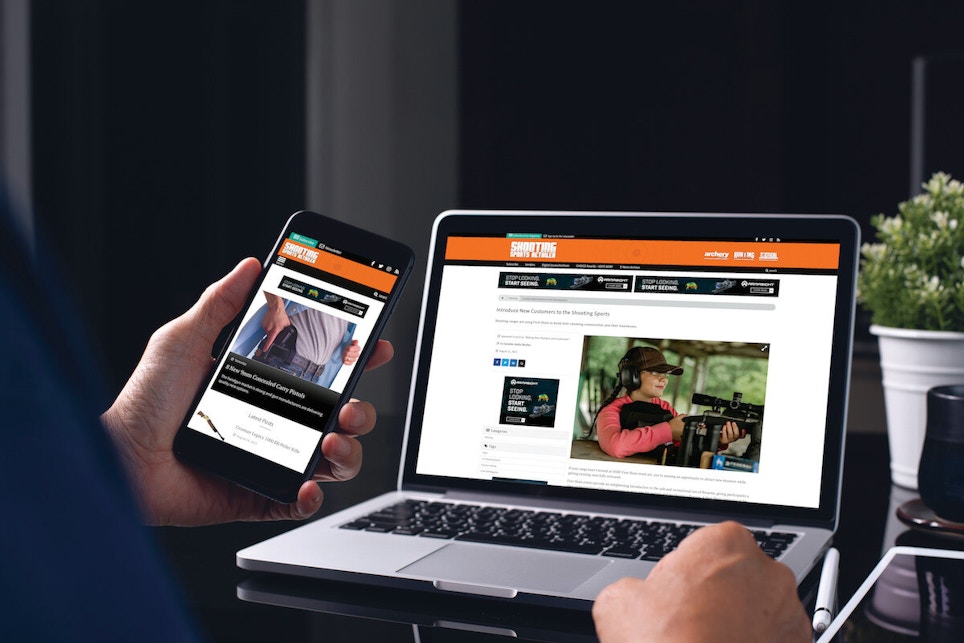
Set up your website for desktop and mobile users. This means making it ‘responsive’ — meaning it will automatically adapt to whatever type of screen dimensions your users are viewing it through — and mobile-friendly. With mobile-friendly, the entire website layout may automatically adapt for use on a mobile phone, which of course is an entirely different type of user experience than a desktop or laptop screen. The key here is to think of the mobile experience first or primarily as most website viewers are likely viewing it using a mobile device. Most website authoring tools take care of this but it’s key to check the experience on a variety of devices (tablets or phones, Android or iOS, etc.).
Bonus tip: Ask an actual customer or two about their experiences with your website. Raise the bar by offering them a gift card to your store if they’ll fill out a survey about your website. Do this kind of customer research on a quarterly basis. Listen to what they say and decide whether to act on their feedback.


