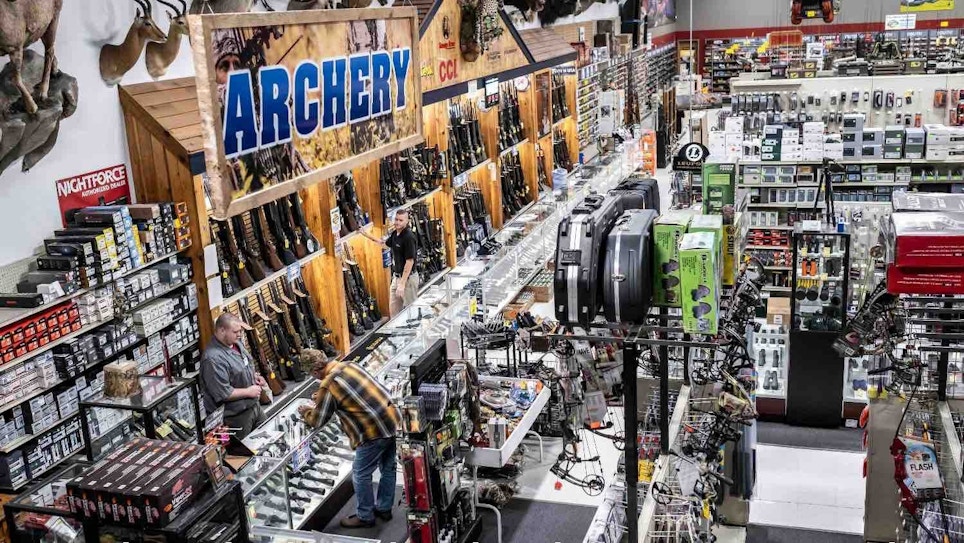
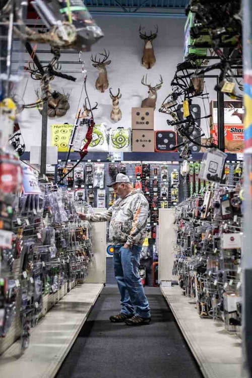
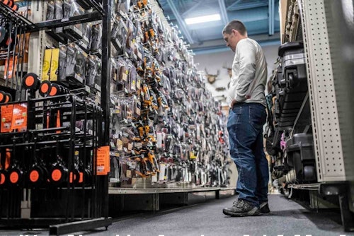
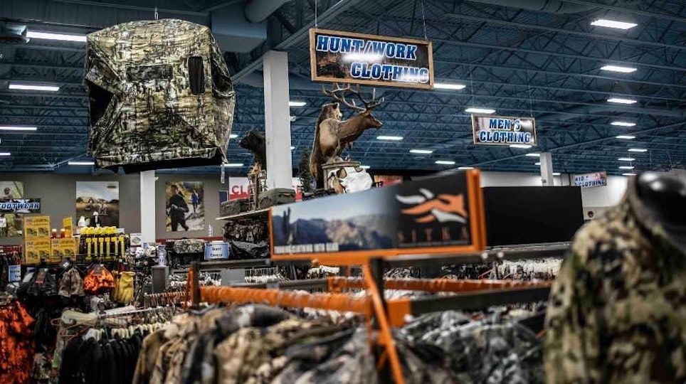
The retail space has never been more competitive, and with the advent of e-commerce, social media, and other methods of reaching consumers, it isn’t easy to move product. So, when people do walk through your store’s front door, it’s crucial to design a floor layout that produces desirable results. Here are how some shop owners optimize their floor plans, with insights and tactics that help increase sales. It’s time to modernize into an effective floor plan.
Think About Traffic Flow
Your store experience should be pleasing to customers, not a burden or bad outcome. Finding a system that helps traffic flow throughout the store is a much-needed thing. Find a system that fosters good flow, that doesn’t create traffic jams, and that directs movement the way you want and need it to for improved customer experience and increased sales.
Maximize Floor Space
Your floor space directly impacts your bottom line. Maximizing the size and efficiency of the floor space will increase how much product is on shelves, and how well these items sell. Think logically, though. Don’t cram in as much as possible; instead, find an appropriate balance between offering a lot of items and cluttering the store.
Choose a Floor Layout Type
Part of bettering traffic flow is by building the store based on a proven layout type. A few great options include angular, diagonal, grid, loop, forced, and free flow. Of course, there are other ideas that work well, too. Once you select a layout type, draw up a blueprint for creating it.
Craft Catchy Window Exterior Wall Displays
Some people don’t intend to visit stores, yet they do anyway. Oftentimes, this starts with obvious exterior signage, but a catchy window display can draw in customers, too. This is especially true if you have frequently traveled road frontage. In this case, it’s worth using some floor space in front of the window for a display. If passing traffic volume isn’t high enough, or close enough to see a window display, then floor space is better served for showcasing product.
Vamp Your Entrance
Livening up the entrance to the store can put customers in the right frame of mind right out of the gate. It helps increase the visual appeal of the establishment. It also makes a much better first impression. Both are wins.
Optimize Atmosphere
Boosting morale or store appeal isn’t just visual based. Improving the overall atmosphere includes elevating the senses, especially sound. Set your store apart from others in the area by playing relevant music that customers will like.
Set Up TV Displays
While hyping or tricking customers isn’t advised, educating them certainly is. Consider placing small screens near hot ticket items with videos on a loop that show the features of products. This can be straight info, product reviews, or examples of products being used in the field.
Install Effective Lighting
Drab stores and dark corners do nothing for the seller or buyer. Install effective lighting to boost visual appeal throughout the shop floor. Using the right sizes, styles and installation of lighting fixtures will put focus on key products.
Understand the Power of Color
Colors have a significant ability to influence people in general, but especially consumers. For example, red sparks urgency and encourages a sale. Blue conveys trust and builds a reputation with customers. Green offers relaxation and helps customers to enjoy the shopping experience.
Determine Top Sellers
Generally, you have about 7-8 seconds to grab someone’s attention. If they can’t find what they’re looking for, they’ll either get frustrated or leave. So, determine your top-selling items, and locate these in highly visible areas.
“I’m kind of limited on space here,” said John Gilbert, co-owner of Cumberland Sportsman Supply. “Organize products as much as possible. Whether it’s back tension releases and thumb releases, or one-pin sights and multi-pin sights, organize items where they are easier to find. This is the biggest thing.”
Place Popular Items in the Back
There are certain items that people frequently visit your store to purchase. Knowing what these are, and placing them in the back, forces consumers to walk past other less-popular items. If you have multiple top sellers, establishing these at opposite ends of the store (the back and both sides) can really boost impulse purchases as customers walk by items they like or need, but didn’t necessarily come to buy.
Place Big Winners at Eye Level
The more popular products and items with the best margins should be placed at eye level. This increases the odds of consumers seeing and purchasing this gear. Items you want to put less emphasis on should be on lower shelves. Of course, if the item is for children, placing these on middle to lower shelves is the best eye-level positioning for them.
Place Footprint Decals
There are other ways to direct traffic throughout your store. Placing footprint decals (deer tracks, turkey tracks, arrows, etc.) can encourage a certain flow. Taking these past top-selling merchandise can boost sales as well.
Designate a Seasonal Section
Some items are seasonal. Your store should have an established section just for these items. Designate a certain area of shelf space to position this type of inventory. Over time, customers will know where to go.
Establish a Clearance Area
Every retailer has inventory they can’t move. When a product doesn’t sell, shops need to put it on clearance to get rid of overstock. Establishing a clearance area will help move some of these products. Selling clearance items online is smart, too.
“Of course, you buy products that you think will sell, whether it’s a brand of broadheads, or whatever, and they don’t,” Gilbert said. “You can get stuck with that kind of stuff. Those items should be used to stock your clearance rack.”
Create Compelling End Caps
End caps were made for selling impulse or add-on purchases. Place items here that are linked, similar, or in the same family as the products in the aisle. Oftentimes, customers will see these, realize they need or want it, and pick it up on the way to checkout.
“We have end caps,” Gilbert said. “We use end caps for gear people might forget, such as lighted nocks, batteries for cameras, or whatever. It’s just to highlight products that, where the consumer might walk in and want to buy one thing, and then see some lighted nocks.”
Utilize Higher Wall Space
You aren’t placing merchandise above head-level. That leaves a lot of unused wall space around the interior perimeter of the store. These open walls are perfect for signage that directs traffic. Signs that describe what’s underneath or near them can improve customer experience. Of course, open wall space is great for appealing décor that fits the theme of the store, or the section of products available for sale, too.
“Of course, making it more visible is one thing,” Gilbert said. “Signage helps a lot. But our business here depends a whole lot on our use of the products. We use these. Just like Grim Reaper broadheads — we all use these. The guy that comes in and doesn’t know what to look for, our personal use of the products seems to help a lot.”
Follow ADA Guidelines
Every store must follow ADA guidelines set by the Americans with Disabilities Act. Parking, entries, exits, aisles, restrooms and numerous other areas and aspects of your store must be able to accommodate everything outlined within this store-governing law. This also extends beyond your physical store and impacts your website as well.
Place Your Checkout Area Strategically
Most shoppers naturally walk counterclockwise to the right and loop around the back and finish their shopping journey along the left side of the store before exiting. Therefore, placing the checkout area on the front left side of the store makes the most sense.
“Products placed toward the front of the store don’t sell as much,” Gilbert said. “This is for a couple different reasons, but you’re basically walking past it.”
Clean the Place
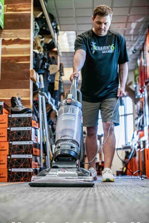
Customers don’t like dirty stores. From the floor to the shelving to the bathrooms, keep everything clean and orderly. Cleanliness minimizes stress for both you and customers. That’s especially true for the OCD type.
Study Your Customers
Knowing exactly how your customers flow throughout the store is an important part of growth and improvement. Analyzing purchase data can reveal what customers buy most often and will help decide where to place certain products. Watching time-lapse videos can also show you general traffic flow, and whether the current floor plan is working well.
“We try to keep it mostly the same, especially for repeat customers who know where to look for stuff,” Gilbert said. “For example, our deer scents and calls always go in a certain place. When deer season is out, and turkey season comes in, we replace that area with turkey gear. Try to keep products in the same place as much as possible.
“I’ve heard arguments the other way — that you should change things up so people have to hunt for desired products, and they might buy something else. But I try to keep it simple and the same, so the repeat customer knows where to come in and look for broadheads, stabilizers or whatever.”
Consult a Professional
It’s important to note that, while I spent many years working in retail, I don’t claim to be an expert or have all the answers. If budget allows, it can certainly pay off to consult a retail professional. Oftentimes, manufacturers even offer services for floor planning at a reasonable price, or no cost at all. There is a lot of store planning software offerings available to business owners, too. Take advantage of these resources.
As you well know, the age of brick and mortar is still here, but it’s dwindled due to increasing volumes of online sales. While your business should exist in both spaces, it’s never been more important to maximize the efficiency of your physical shop. Consider making your store floor plan more effective this year.
SIDEBAR: Start Selling Online
Modern retailers that take e-commerce by the reigns will increase the likelihood of surviving well into the future. Selling online also increases your virtual shelf space. Use it to sell additional items you can’t physically stock. Doing so grows your virtual floor space as much as you decide to. It can even boost sales significantly and improve the bottom line. It’s good for business.
Sidebar: 7 Retail Floor Space Mistakes to Avoid
There are numerous mistakes that shop owners and managers can make. In fact, the list is too long to cover here, but certain blunders tend to crop up more often than others. Here are seven that immediately come to mind.
- Being disorganized disrupts the shopping experience. This makes it more difficult for customers to find what they’re searching for.
- Failing to group similar items diminishes sales. Products that are related should be placed together, or as close together as possible.
- Lacking cohesiveness hinders shoppers. Your products should flow in a logical order.
- Presenting too few options turns customers away. Customers are more educated than ever and want to choose for themselves. Offer items at various price points.
- Presenting too many options isn’t good, either. There’s a line between presenting too few and too many products. The former is worse, but the latter is a mistake, too.
- Avoiding the use of displays, or posting boring ones, translates to fewer eyeballs observing the shelving that would be better served with effective displays.
- Creating too flashy of displays draws too much attention to the signage and distracts from the product itself. Find a happy medium between dull and flashy.
Images by John Hafner
